

Visual Hierarchy and Decision-Making
When People Don’t Notice What Matters
You launch a campaign. The message is clear. The offer is strong. The landing page looks “clean.”
But conversions stall.
When you review recordings, something becomes obvious: people are not clicking where you want. They scroll past key messages. They hesitate.
This isn’t a copy problem. It isn’t a traffic problem.
It’s a visual hierarchy problem.
Because before people read, they look.
And before they decide, they scan.
Visual hierarchy determines what gets seen first, what gets noticed next, and what gets ignored completely. And attention, not intention, is what drives decisions.
What Visual Hierarchy Really Is
Visual hierarchy is the deliberate arrangement of elements to guide user attention in a specific order.
It answers three silent questions every viewer asks in milliseconds:
- What is this?
- What matters most?
- What should I do next?
If your design doesn’t answer those questions instantly, the brain conserves energy. It disengages.
The Brain’s Shortcut System
From a design psychology perspective, humans do not read left to right first. They scan for contrast, size, movement, and color.
The brain is wired to notice:
- Bigger elements before smaller ones
- High contrast before low contrast
- Faces before objects
- Movement before static content
- Simplicity before complexity
This is survival biology. Your landing page is competing with thousands of years of cognitive wiring.
If everything is bold, nothing is important.
If everything is loud, nothing is heard.
Practitioners at Nielsen Norman Group describe visual hierarchy as the core mechanism that “guides the eye to the most important elements” through scale, contrast, and grouping , a practical frame that ties design choices to measurable attention patterns.
Attention is a limited resource.
Visual hierarchy decides where it’s spent.
How Visual Hierarchy Shapes Decisions
Marketing leads often think decisions are rational. Product owners often think usability is about features.
But decision-making is sequential. And the sequence is visual.
Step 1: Recognition
The user must understand where they are.
Headline clarity. Strong focal point. Clear value proposition.
If the eye wanders, clarity drops.
Step 2: Relevance
Next, the brain asks: “Is this for me?”
Subheads, supporting visuals, and structured content blocks reinforce relevance.
Without visual flow, even strong messaging feels fragmented.
Step 3: Action
Only after clarity and relevance comes action.
Your CTA cannot compete with ten equally bold elements. It must sit at the top of the visual pyramid.
This is why in high-performing pages, you’ll notice:
- One dominant headline
- One clear primary action
- Supporting content in descending visual weight
Not because it looks minimalist.
Because it reduces cognitive friction.
Design theorist Don Norman argues that good design reduces unnecessary cognitive load and channels behavior through clear affordances, a principle that underpins why hierarchy matters for decisions, not just aesthetics.
The Mechanics of Visual Flow
Visual hierarchy is not decoration. It is architecture.
Let’s break down the core drivers.
Size and Scale
Larger elements attract user attention first. This is your headline, hero number, or primary message.
If your headline and body copy are visually similar, you’ve flattened your hierarchy.
Contrast and Color
Contrast creates separation. It tells the brain, “This is different.”
CTA buttons that blend in do not get clicked. Not because users disagree. Because they don’t notice.
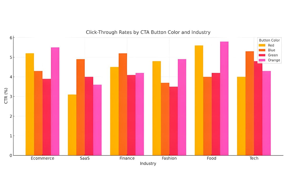
Synthesis of A/B test case collections shows that visual treatments (size, contrast, color) can shift click-through and conversion rates substantially; some controlled tests report uplifts in the 20–34% range for optimized primary actions. (See conversion testing analyses compiled by CXL).
Spacing and Grouping
White space is not empty space. It is structure.
Elements placed close together are perceived as related (Gestalt principle of proximity).
Spacing creates rhythm. Rhythm creates readability.
Alignment and Direction
The eye follows lines. It follows arrows. It follows gaze direction in images.
If a person in your hero image looks toward your headline, user attention follows. If they look away, attention drifts.
Visual flow is directional psychology.
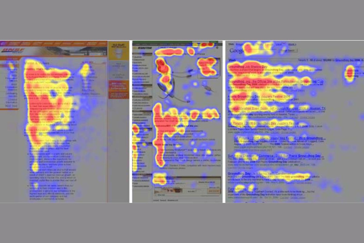
Early and repeated eye-tracking research (the “F-shaped” scanning pattern) shows users concentrate their fixations at the top and left of pages, reinforcing why a top-left hierarchy and prominent headlines matter for information capture.
If users feel overwhelmed, your hierarchy is competing with itself.

Business Outcomes of Strong Visual Hierarchy
This isn’t aesthetic theory. It’s performance design.
When visual hierarchy is intentional:
- Engagement increases because users know where to focus.
- Bounce rates decrease because clarity reduces confusion.
- Conversion improves because action pathways are obvious.
- Brand clarity strengthens because messaging feels structured and confident.
When it’s weak:
- “People don’t notice what matters.”
- Teams blame copy.
- Leaders blame traffic.
- Designers add more elements.
The real fix is subtraction and order.
Conversion testing roundups show repeated wins from hierarchy-focused changes , for example, high-contrast CTA treatments and clearer hero headlines often produce measurable CTR lifts in controlled A/B tests (see CXL’s color and CTA summaries and aggregated CRO case collections).
Academic research using eye-tracking across purchase tasks demonstrates that user attention patterns vary with task and that high-priority info must be visually prominent during decision tasks to reduce search time and errors (see Cortinas et al.).
For deeper thinking on structured brand systems, see our perspective on visual identity and strategic clarity (Visual Identity Systems).
If you’re refining user journeys, explore our UX design insights (UX Design Principles That Convert).
And when visual hierarchy becomes part of your broader brand architecture, digital branding gains consistency across touchpoints (Digital Branding Framework).
How Marketing and Product Teams Can Apply This Today
You don’t need a redesign to start improving hierarchy.
Ask these practical questions:
- Is there one unmistakable focal point above the fold?
- Does each section have a clear visual entry point?
- Are secondary messages visually secondary?
- Is the primary CTA the most visually dominant action element?
- Does spacing support grouping, or create clutter?
Then test it.
Blur your screen slightly. What still stands out? That is your real hierarchy.
If the wrong element dominates, the design is speaking louder than your strategy.

Many teams start with simple A/B tests (headline prominence, CTA contrast, hero image direction). Aggregated case studies show that such iterative tests deliver meaningful percentage gains without full redesigns. See conversion case compilations for test ideas and outcomes.
For structured implementation, our graphic design services focus on aligning design psychology with measurable business outcomes. Our brand strategy team ensures visual systems reinforce positioning, not dilute it.
Frequently Asked Questions
- What is visual hierarchy in simple terms?
Visual hierarchy is how design guides the order in which people see and process information.
- Why does visual hierarchy affect conversion rates?
Because decisions follow attention. If users don’t notice your key message or CTA, they cannot act on it.
- How does design psychology influence user attention?
Design psychology studies how the brain responds to visual stimuli like size, contrast, spacing, and alignment. These factors shape how users scan and interpret content. See foundational eyetracking and visual hierarchy research for details.
- Can strong visual hierarchy improve brand clarity?
Yes. When messaging is visually structured, it reinforces confidence, professionalism, and strategic focus.
- Is minimal design the same as good hierarchy?
Not always. Minimalism can still lack hierarchy if elements compete visually. Hierarchy is about order, not emptiness.
Final Thoughts
If your audience isn’t noticing what matters most, the issue may not be your message. It may be the order in which it’s seen.
Visual hierarchy is not decoration; it’s decision architecture.
See how our Brand Strategy & Identity Design Services align visual flow with business goals.
Ready for clarity? Book a consultation and let’s evaluate what your audience sees first, and what they miss.