

Friction Points That Kill Conversions
Traffic is coming in.
Campaigns are running. Click-through rates look healthy. The dashboard says people are interested.
But conversions are flat.
This is where most teams look for a bigger idea, a new headline, or more traffic. In reality, most losses don’t come from strategy failures. They come from small moments of conversion friction, subtle UX friction points that quietly push users away.
Let’s diagnose them.
What Conversion Friction Really Looks Like
Conversion friction isn’t dramatic. It doesn’t crash the page. It doesn’t trigger alarms.
It hesitates.
It slows.
It makes people think when they shouldn’t have to.
Every extra second of uncertainty creates doubt. Doubt creates drop-offs.
Jakob Nielsen’s usability heuristics stress that unnecessary cognitive load and unclear system status create the exact kind of hesitation that kills conversions. Nielsen Norman Group
The Micro-Moments That Matter
- A form field that feels too invasive
- A CTA button that blends into the background
- A price revealed too late
- A checkout page that asks for unnecessary details
None of these are fatal on their own. Together, they compound.
And compounding friction reduces conversion rates far more than most teams realize. Research from the Baymard Institute shows global cart abandonment averaging around 70%, a clear sign that hidden usability issues and micro-friction stack up into large revenue loss.
Users don’t abandon because they’re confused.
They abandon because they feel friction.
Confusion is cognitive.
Friction is emotional.
And emotion wins.
The 5 UX Friction Points That Kill Conversions
Let’s break down the most common usability issues we see when “traffic is there, conversions aren’t.”

1. Cognitive Overload
When users land on a page, their brain scans for clarity:
- What is this?
- Is it for me?
- What do I do next?
If your page forces them to decode messaging, compare too many options, or search for the next step, friction increases.
Fix: Reduce visual noise. Clarify hierarchy. One primary action per page.
Simplicity signals competence. Complexity signals risk.
Nielsen Norman Group’s heuristic “recognition rather than recall” argues for designs that reduce memory burden, the same principle that reduces cognitive friction and increases conversions.
2. Unclear Value Proposition
A vague headline creates uncertainty.
If users cannot immediately understand the benefit, they hesitate. Hesitation is conversion friction.
Compare:
- “Innovative Solutions for Growth”
- “Reduce Checkout Abandonment by 32% in 60 Days”
Specific outcomes convert better because they reduce mental effort.
Fix: State the outcome. Make the benefit tangible. Lead with results, not adjectives.
Forrester’s work (cited widely in CRO guides) notes improved UX design can dramatically increase conversion metrics, sometimes quoted up to several hundred percent improvement in specific contexts, because clarity reduces friction and decision friction.

3. Form Fatigue
Every additional field increases friction.
Phone number. Company size. Budget range. How did you hear about us?
Each one asks for effort and trust.
If the perceived value doesn’t outweigh the effort, users leave.
Fix: Only ask for what is required at that stage. Progressive profiling works better than front-loading everything.
Expedia, as a case study, famously removed or clarified a single field and reported a multimillion-dollar improvement in bookings, an often-cited example of how tiny form changes remove confusion and materially increase revenue.
4. Hidden Costs and Surprises
Nothing kills trust faster than unexpected friction at the final step.
Shipping costs revealed late.
Mandatory account creation.
Unexpected fees.
At this stage, the user has already invested time. A surprise feels like betrayal.
Fix: Surface costs early. Be transparent. Remove avoidable barriers.
Trust reduces UX friction dramatically, a principle supported by CRO literature and practical experiments by optimization teams.

5. Slow Load and Performance Delays
Speed is perception.
Even a one-second delay changes user behavior. Several industry reports (Google, Akamai) and academic summaries show that even very small delays correspond to measurable drops in conversions and satisfaction; commonly cited numbers include around a 7% conversion drop per one-second delay in some contexts.
Fix: Optimize images. Reduce scripts. Prioritize mobile performance.
Smooth experiences signal brand competence. Friction suggests operational weakness.
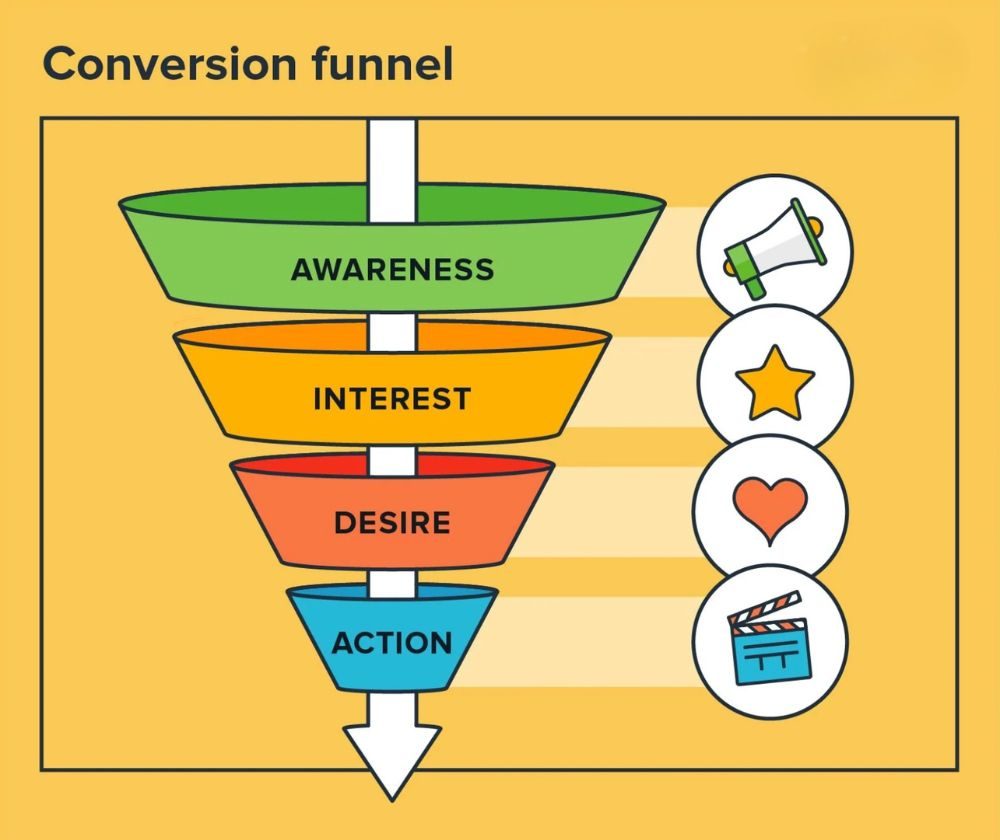
Where Friction Hides in the Funnel
Friction rarely lives at the top of the funnel. It concentrates near intent-heavy stages:
- Pricing page
- Checkout
- Lead submission
- Demo booking
That’s where usability issues become expensive.
Why Small Friction Costs Big Revenue
Marketing teams often respond to low conversion rates by increasing traffic spend.
But if friction remains, you’re pouring water into a leaking bucket.
A 1% improvement in conversion rate often outperforms a 20% increase in traffic spend, with lower acquisition cost. McKinsey and other analytics teams show that small percentage gains in conversion or pricing can have outsized profit effects, which is why removal of friction is often the highest-ROI activity.
This is why conversion optimization is less about persuasion and more about removal.
Remove doubt.
Remove effort.
Remove delay.
Conversions rise.
Most growth doesn’t require new campaigns.
It requires fewer obstacles.
Diagnosing Conversion Friction in Your Brand Experience
Here’s a practical audit framework:
Step 1: Watch Real Behavior
Session recordings and heatmaps reveal hesitation zones. Tools such as session replay and heatmaps are recommended to pinpoint micro-friction. Industry guides from Shopify and CRO practitioners provide step-by-step CRO analysis workflows.
Step 2: Identify Drop-Off Clusters
Look at analytics around:
- Form abandonment
- Checkout exits
- Pricing page bounce
Use Baymard’s checkout research and aggregated abandonment stats as benchmarks when evaluating your funnel.
Step 3: Ask One Question
“What is making this harder than it needs to be?”
Often, the answer is not strategic. It’s structural.
For deeper strategic alignment, see how we approach experience design in our
Brand Strategy service and Web Development & UX Design offering.
Related reads:
- Designing for User Confidence
- UX vs UI: Where Strategy Really Lives
- Website Design as a Brand Experience
Frequently Asked Questions
- What is conversion friction?
Conversion friction refers to any usability issue, delay, or uncertainty that makes it harder for users to complete a desired action, such as signing up or purchasing.
- How do UX friction points affect revenue?
Small usability issues reduce completion rates. Lower completion rates directly reduce revenue without reducing traffic costs. Baymard’s long-term tracking of cart abandonment quantifies how incremental UX problems aggregate to large losses.
- Is conversion friction only a design issue?
No. It spans messaging clarity, information hierarchy, performance, and interaction design.
- How can I identify usability issues quickly?
Review analytics for drop-offs, observe session recordings, and test forms personally. Friction is often obvious once you look for it. Nielsen Norman Group’s heuristic evaluation method is a practical first step.
- Should I focus on traffic or friction first?
If traffic exists but conversions lag, prioritize removing friction before increasing spend.
The Real Takeaway
Traffic alone doesn’t drive growth. Clarity does.
When friction disappears, decisions become easier, and conversions follow.
See how our web design and digital branding services help teams simplify the user journey and turn interest into action at Adessi.
If you’re ready to uncover where usability issues may be blocking conversions, talk with our team.