

Consistency in Visual Language
A customer sees your Instagram ad. Clicks through to your website. The colors are different. The fonts don’t match. The whole thing feels… off.
They haven’t read a single word of copy yet, but they’ve already made a decision: something here doesn’t add up. That hesitation? It’s the cost of inconsistent visual language, and it’s more expensive than most brands realize.
Why Your Brand Feels “Off” (And Your Audience Can Tell)
Here’s what makes visual inconsistency tricky: your audience rarely identifies the problem. They just feel it.
A prospect scrolling through your LinkedIn page sees one color palette. They open your proposal deck and see another. Your website uses a clean sans-serif; your brochure uses something decorative. None of it is wrong individually. But together, it creates a quiet kind of confusion, the kind that makes people trust you a little less without knowing why.
This isn’t a design problem. It’s a perception problem.
According to the 2025 Edelman Trust Barometer, trust now sits alongside price and quality as a deciding factor in purchase decisions, with 80% of consumers saying they trust the brands they use more than traditional institutions like government, media, or NGOs. That kind of trust doesn’t get built through one brilliant campaign. It gets built through repetition, showing up the same way, every time, until reliability becomes your reputation.

When your visual language shifts between channels, your audience has to do the mental work of confirming they’re still dealing with the same company. That extra cognitive effort, even a fraction of a second, creates friction. And friction, in marketing, is where interest goes to die.
What Visual Brand Consistency Actually Means
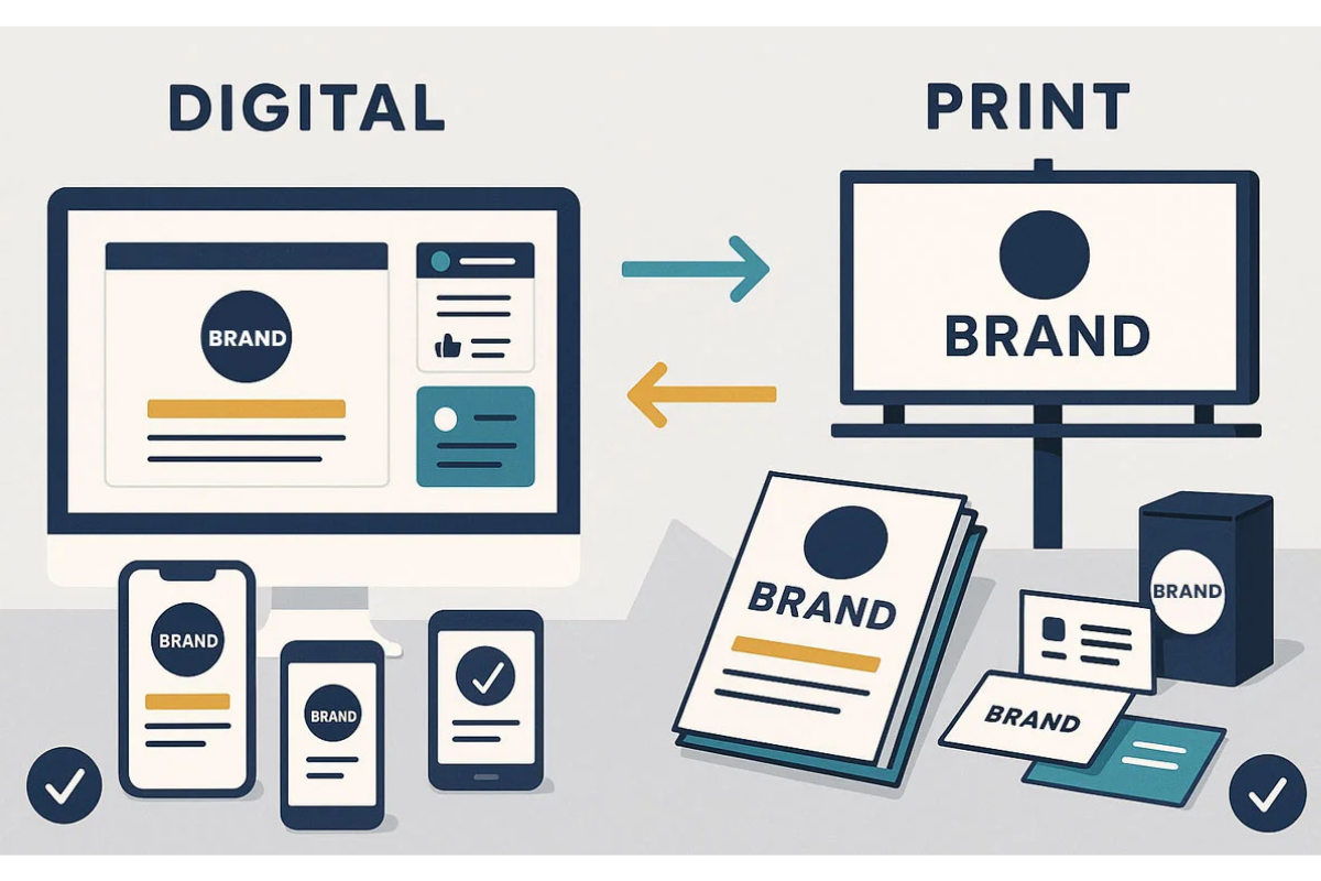
Let’s clear up a common misconception: visual brand consistency is not about making everything look identical. It’s about making everything feel connected.
Think of it like a family. Siblings don’t look exactly alike, but you can tell they’re related. There’s a shared DNA, in the bone structure, the expressions, the mannerisms. Brand systems work the same way. Each piece can be distinct, adapted to its channel and context, but the underlying visual language stays recognizable.
The Five Pillars of a Visual Language
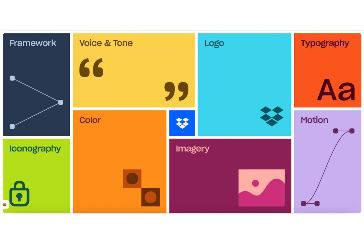
A functional brand system typically anchors on five elements:
Color. Not just your primary palette, but how you use it. Which colors dominate? Which ones accent? What are the rules for backgrounds, text, and calls to action? Research from the University of Loyola, Maryland found that a consistent color palette can increase brand recognition by up to 80%. Color isn’t decoration, it’s identification.
Typography. Your typeface choices set tone before a single word is read. A serif says established. A geometric sans-serif says modern. The issue isn’t which one you pick, it’s whether you use the same one everywhere.
Imagery. Photo style, illustration approach, image treatment. Do your photos feel warm or clinical? Do they feature people, products, or environments? Establishing these patterns makes every new asset feel like it belongs.
Layout and spacing. How elements relate to each other on a page, the breathing room between sections, the alignment rules, the grid. This is the silent architecture of recognition.
Iconography and graphic elements. The small details, icon style, line weights, patterns, dividers, that create texture and reinforce identity at the micro level.
When these five elements are defined and followed, you stop producing individual assets and start building a brand system.
The Real Cost of “Close Enough”
Most brand inconsistency doesn’t happen because teams don’t care. It happens because they don’t have a clear system, or the one they have is buried in a PDF nobody opens.
In fact, Lucidpress found in their State of Brand Consistency report that while 95% of organizations have brand guidelines, only about one in four consistently enforce them. The gap between having rules and following them is where consistency falls apart.
Here’s what “close enough” actually costs:
Wasted Time and Resources
Without clear visual standards, every new project starts with a guessing game. Your designer picks a shade of blue from memory. Your social media manager grabs a font that “looks right.” Your sales team builds a deck using whatever template they find first. Each of these small decisions adds up to hours of rework, and a brand that looks like it was built by five different companies.
Eroded Trust
Audiences register visual inconsistency as a signal of disorganization. Fair or not, if your brand materials don’t cohere, prospects assume your services might not either. For B2B brands especially, where trust is the currency of long sales cycles, that assumption is costly.
Lost Revenue
The same Lucidpress research found that consistent brand presentation can increase revenue by up to 33%. Not because consistent brands are prettier. Because they’re easier to recognize, easier to trust, and easier to choose. When your visual language shifts, you reset that recognition clock every time.
Building Consistency That Scales
The goal isn’t perfection. It’s a system that’s easy enough for everyone on your team to use correctly, without needing a designer in the room.
Start With a Living Style Guide
A static brand book isn’t enough. What works is a living style guide, a shared, accessible document that your team actually references. It should include your color codes (hex, RGB, CMYK), type hierarchy with specific sizes and weights, image guidelines with do/don’t examples, layout templates for your most common formats, and logo usage rules with clear-file access.
The key word is accessible. If your brand guidelines live in a forgotten Dropbox folder, they don’t exist.
Build Templates, Not Just Rules
Rules tell people what to do. Templates show them how. For every recurring format, social posts, pitch decks, email headers, blog graphics, create a template that bakes in the visual language. This reduces decision-making and keeps consistency automatic rather than aspirational.
Audit Regularly
Visual consistency drifts. It’s natural. New team members join. Vendors produce assets without full context. Channels evolve. Schedule a quarterly visual audit across your key touchpoints: website, social media, sales collateral, email, and advertising. Look for the gaps. Fix them before they compound.
System1 research, which analyzed 56 brands and over 4,000 TV ads across a five-year period, confirmed that consistent brands scored significantly higher in emotional response testing. The longer you hold steady, the further ahead you pull from competitors, not by being louder, but by being more recognizable.
Frequently Asked Questions
How is visual brand consistency different from brand guidelines?
Brand guidelines are the rulebook. Visual brand consistency is the result of following that rulebook across every touchpoint, every time. You can have a beautifully designed style guide and still have inconsistent execution if the team doesn’t use it. Consistency is a practice, not a document.
What’s the fastest way to fix inconsistent branding?
Start with your highest-traffic touchpoints, your website, social media profiles, and sales decks. Align those three first, and you’ll cover the majority of your audience’s brand experience. Then work outward to print, email, signage, and secondary materials.
Does visual consistency mean every piece of content looks the same?
No. Consistency means every piece of content feels related. A social media post and a whitepaper will look different by nature, different formats demand different approaches. But the underlying visual language, the colors, type, image style, and spacing, should create a clear thread that ties them together.
How do brand systems help remote or distributed teams stay consistent?
Brand systems centralize decisions. When a remote team member needs to create a presentation, they pull from the same templates, color codes, and image library as everyone else. The system removes guesswork, which is where inconsistency typically starts.
How often should we update our visual brand system?
Review your brand system annually and audit execution quarterly. Update when your business strategy shifts, when you enter new markets, or when your visual language starts feeling dated relative to your industry. Evolution is healthy, just make sure it’s intentional, not accidental.
Consistency Is a Competitive Advantage
The brands that win long-term aren’t always the loudest or the most creative. They’re the ones that show up the same way, every time, everywhere.
That kind of reliability doesn’t happen by accident. It happens through systems, clear, practical frameworks that make consistency the path of least resistance for everyone who touches the brand.
If your brand feels disconnected across channels, the fix isn’t a redesign. It’s a system.
Ready to Build a Brand That Looks Like It Belongs Together?
If your team is spending more time debating fonts than building campaigns, it might be time to invest in a brand system that does the heavy lifting. Adessi helps ambitious brands turn scattered visuals into a cohesive, scalable identity.