

Visual Branding: How Design Builds Trust and Drives Conversion
When a Brand Looks Good, but Doesn’t Work
“Our brand looks good. People even compliment it. But it’s not doing anything.” A statement by a founder that sounded harmless.
What he really meant was simple: the website wasn’t converting, proposals weren’t closing faster, and people who “liked the look” still didn’t remember the name a week later.
That gap is common, and it’s rarely about talent. It’s usually because the business has brand design (nice pieces), but not visual branding (a working system).
Here’s the research-backed truth: people make fast judgments about credibility and feel in seconds, based heavily on what they see. Stanford’s web credibility research found that a large share of credibility comments were tied to design look and feel, layout, typography, color, and overall visual appeal. And other work shows that first impressions of web pages can form in as little as 50 milliseconds.
This article breaks down how visual branding shapes three business outcomes founders care about:
- Trust (Do we feel credible?)
- Brand recognition/recall (Will they remember us?)
- Conversion confidence (Will they take the next step?)
What Visual Branding Really Is (And What It Isn’t)
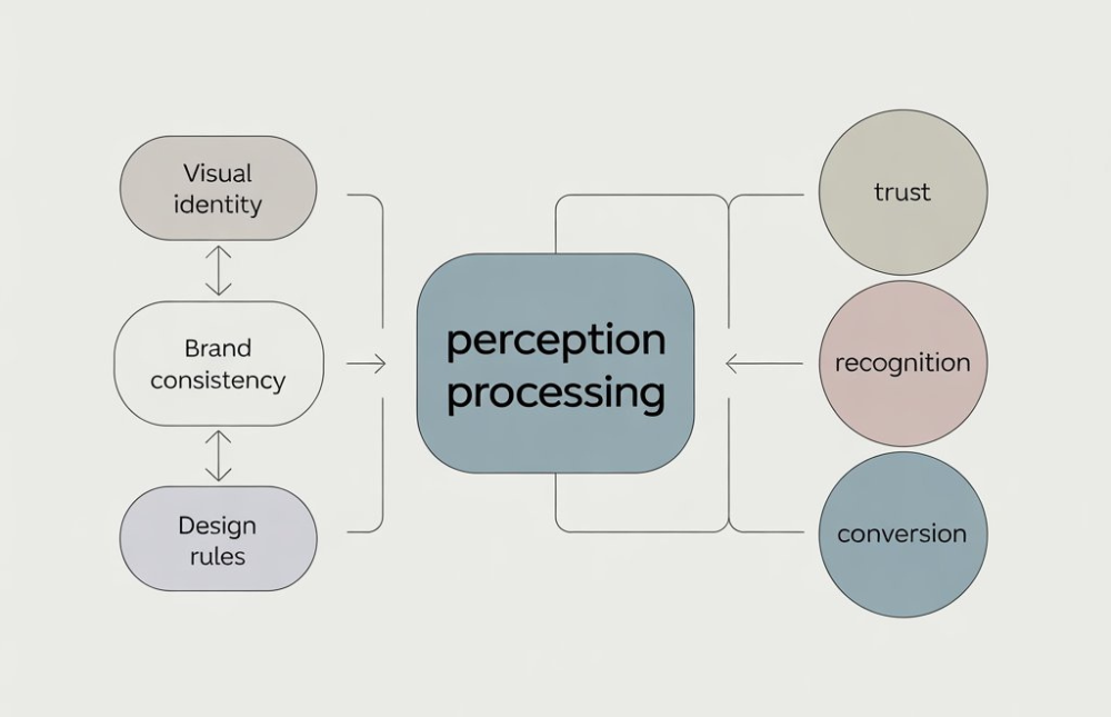
Visual branding is not “making things pretty.” It’s the visual identity behaving consistently across real situations: a landing page, an email, a pitch deck, a proposal, a social media post, a product UI.

Visual branding is a system, not a style
A practical visual branding system includes:
- Color logic (where and why each color appears)
- Typography rules (hierarchy, spacing, tone)
- Layout structure (grids, margins, rhythm)
- Image direction (what counts as “on brand”)
- Component rules (buttons, headers, icons, charts)
- Usage constraints (what not to do under pressure)
When these pieces work together, the viewer doesn’t have to fight the page. That reduction in mental work matters: it often shows up as trust and “this feels legit.”
“Design doesn’t matter; product does.”
Some leaders push back and say, “If the product is good, people will buy. Design is secondary.”
There’s truth there, poor product kills growth faster than poor design. But design is still part of how product value is understood and trusted at the moment of decision. Nielsen Norman Group, for example, has long documented how people’s first reactions to a site influence perceptions of credibility and usability, before they’ve tested the product deeply.
So the more useful view is this: product wins long-term, but visual branding often decides whether people give you a fair chance today.
How Visual Branding Builds Trust Before a Single Word Is Read
Trust starts as a feeling: “This looks like a real business.”
Stanford’s research is blunt about what people notice: amateurism hurts credibility, and visual cues are a major part of how credibility judgments are formed. That’s not about being flashy. It’s about looking intentional.

Visual consistency signals reliability
When your website, social templates, and sales materials feel like they come from the same place, you look organized. Organized reads as capable. Capable earns trust.
Nielsen Norman Group calls out design quality as one of the ongoing factors that communicates trustworthiness, alongside clear content and transparency.
Design isn’t “trend,” it’s behavior
McKinsey’s design research frames design as a management discipline, not decoration. Their findings connect strong design practices with stronger business performance, suggesting the best performers treat design with the same seriousness as other performance drivers.
Plain-English translation: trust is easier to earn when your brand looks like it’s being run, not improvised.
Visual Branding and Brand Recognition: Why Familiarity Wins
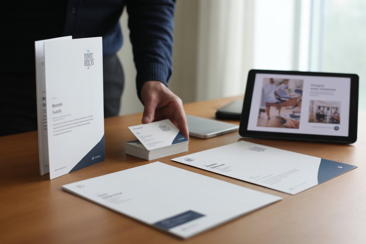
Recognition isn’t built by repeating your logo everywhere. It’s built by repeating a pattern people can spot.
Recognition comes from repeated structure, not repeated logos
People remember:
- the spacing
- the way headings look
- the color relationships
- the “shape” of your layouts
- how photography or illustration is treated
When those stay consistent, your brand becomes familiar. Familiarity reduces risk.
Consistency has a measurable impact
Lucidpress (now Marq) has repeatedly reported that consistent brand presentation correlates with revenue lift, often cited up to 33% in their State of Brand Consistency reporting and related announcements.
You don’t need to treat that number as a promise. But you should treat it as a signal: consistency is not a soft preference; it can be a growth lever.
Recognition is a shortcut for busy minds
When a buyer is skimming five vendors, recognition becomes a shortcut:
“I’ve seen these people before. They feel established.”
That feeling can be created by a coherent design strategy, not by louder marketing.
How Visual Branding Influences Conversion Confidence
Most conversion problems aren’t “people don’t want it.”
They’re “people aren’t sure it’ll work out.”
Visual branding reduces that uncertainty.
Good design removes silent objections
Before someone clicks “Book a call,” they ask:
- Is this safe?
- Will this be a smooth process?
- Do they seem competent?
- Will I regret choosing them?
Those questions are often answered by visual cues: hierarchy, spacing, consistency, and clarity.
And first impressions happen fast. Research suggests people form quick visual impressions of websites, on the order of tens of milliseconds, which can shape whether they stay or leave.
Case study 1: “Design system” as conversion support, a look at Shopify Polaris
Shopify’s ecosystem is built around consistency. Their design system (Polaris) exists so experiences feel coherent across apps and interfaces. Developers and partners describe using Polaris to create UIs that fit Shopify’s environment and reduce inconsistency as features scale.
Why this matters for conversion: consistency reduces friction. Friction kills confidence.
Case study 2: Visual identity helping repositioning, examining Mailchimp.
In its case study, COLLINS describes Mailchimp’s rebrand as supporting a move upmarket, attracting larger customers while keeping existing audiences, along with reducing product sprawl into a clearer platform story.
Why this matters: visual branding isn’t only “look.” It can clarify what a company is, which reduces confusion at the decision point.
Case study 3: A conversion lift from checkout design changes, insights into illustrative
OuterBox reports a checkout redesign that led to an overall conversion rate increase of about 5% on tablet and mobile.
This is an agency-reported case study (not peer-reviewed), so treat it as directional, not a universal truth. But it matches what we see in practice: better hierarchy and clarity can produce measurable lifts.
Design Strategy: Where Visual Branding Either Works or Breaks
The difference between “pretty” and “profitable” is usually a design strategy and a clear intent.
Strategy defines what design must do
Before colors and fonts, founders need answers:
- Who must trust us first?
- What makes them hesitate?
- What signals credibility in this category?
- Where do people drop off?
- What must be instantly clear?
This is the business-facing layer. Without it, design becomes subjective debates.
“Too polished can feel suspicious.”
Some research and practitioners note a real nuance: overly slick design can sometimes trigger skepticism (“What are they hiding?”), depending on category and audience expectations. Stanford’s credibility work emphasizes that people look for a “real-world feel” and can be sensitive to signals that feel artificial or overly commercial.
So the goal isn’t “fancier.” The goal is believable for your market.
Visual Branding Is a Silent Sales Tool
If you lose trust, you lose the sale, and you may lose the customer. Nielsen Norman Group’s work on trust and credibility in e-commerce reinforces how critical credibility cues are in willingness to transact.
Visual branding is one of the strongest “silent cues” you control.
It either lowers resistance or creates it.
Frequently Asked Questions
What’s the difference between visual branding and brand design?
Brand design is the output (logo, website, templates).
Visual branding is the system that keeps everything consistent and meaningful across touchpoints.
Can visual branding really affect conversion?
Yes, by increasing credibility, reducing confusion, and improving confidence. Fast first impressions and trust cues are well-supported in UX and credibility research.
How often should visual branding be updated?
Review it quarterly; update it when strategy changes (new audience, new offer, new positioning). Avoid changes driven by trends.
Is visual branding only important for big brands?
No. It’s often more important for growth-stage brands trying to build trust quickly in competitive markets.
What’s the biggest mistake companies make?
Treating visual identity as a one-time project instead of a system, then letting every channel drift.
Turning Visual Insight into Execution
If your brand looks polished but isn’t converting the way it should, the issue is rarely effort, it’s alignment.
Explore how Adessi approaches visual branding and design strategy to build trust, brand recognition, and conversion confidence.
Or see how we translate brand design into a consistent visual identity system across web, social, sales, and print.