Soaring Eagles
A brand that reflects care, growth, and structure.
The Brief
SELC wanted a brand that communicated trust, professionalism, and warmth, without feeling generic or overly playful.
They also needed digital and print materials that helped parents quickly understand their programs, values, and learning approach.
Our Approach
We shaped SELC’s brand around clarity and reassurance, creating:
- Brand strategy and positioning
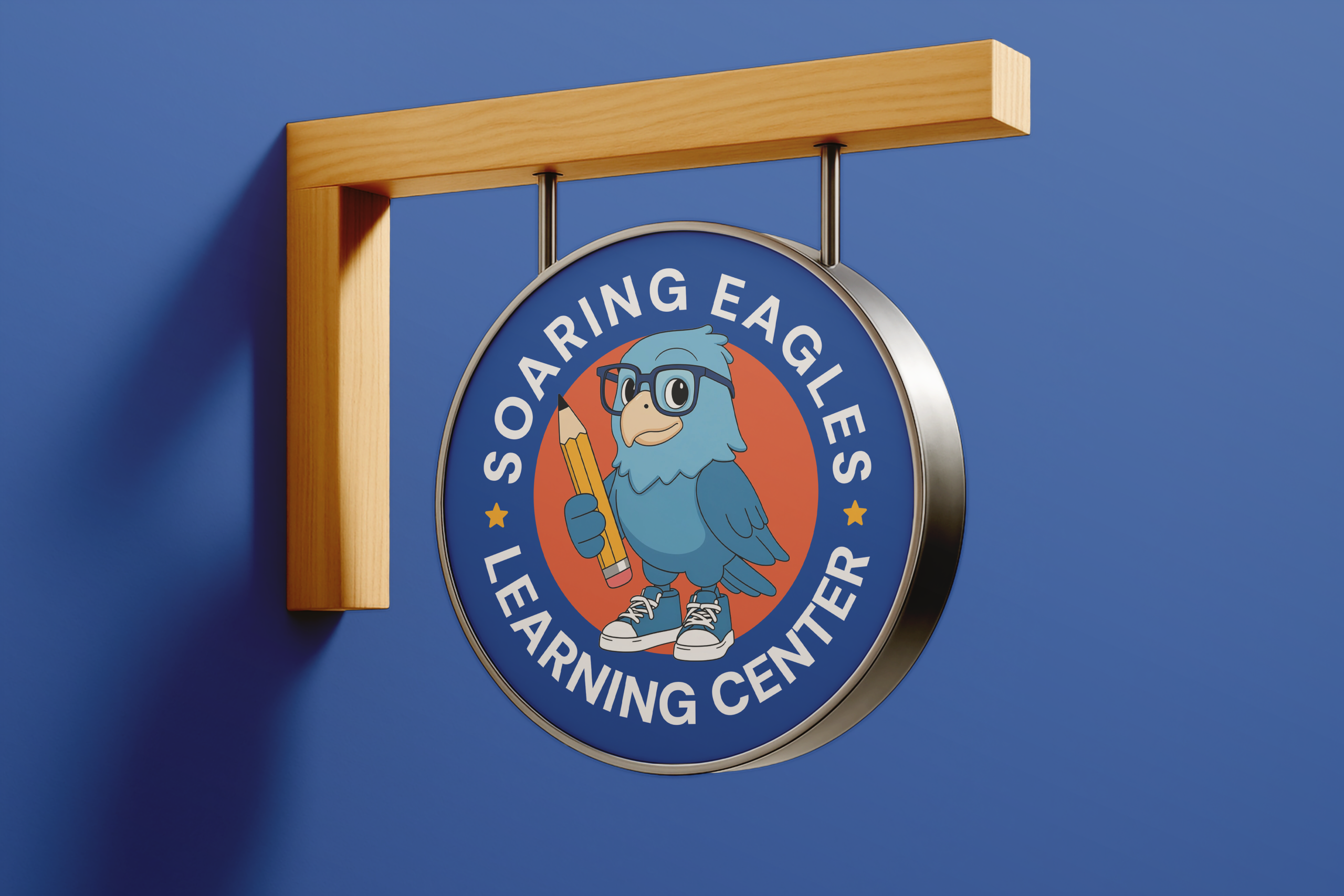
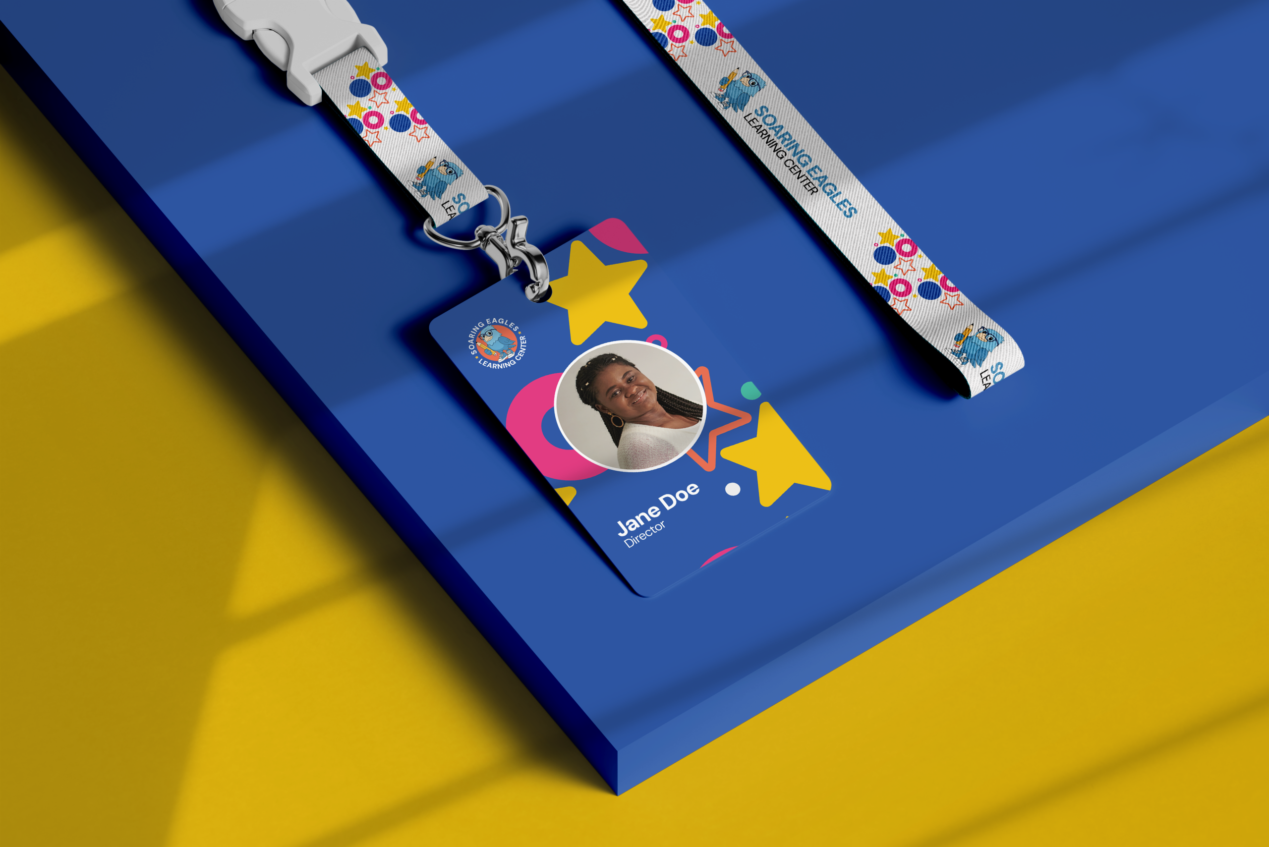
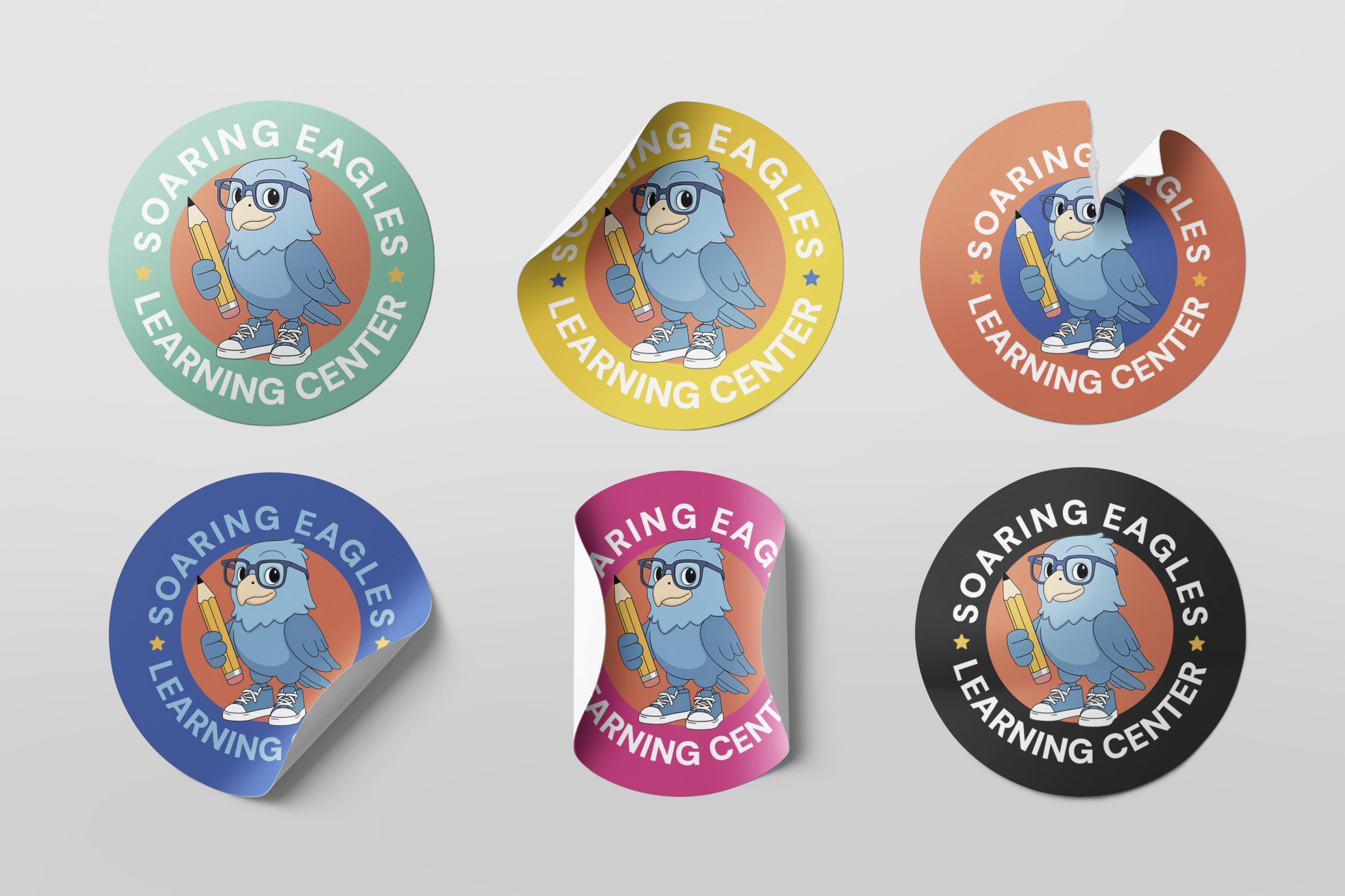
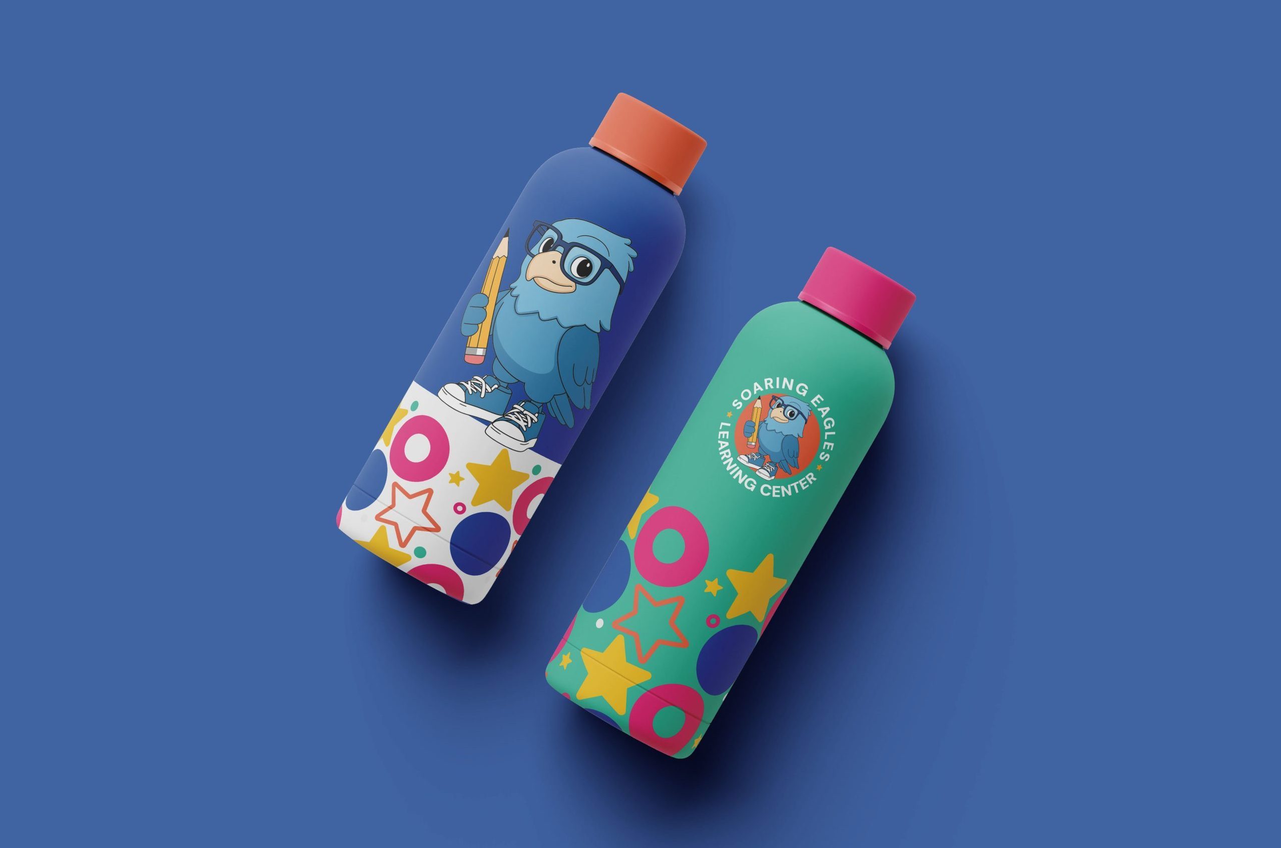
- Visual identity and brand guide
- Messaging framework
- Website content and structure
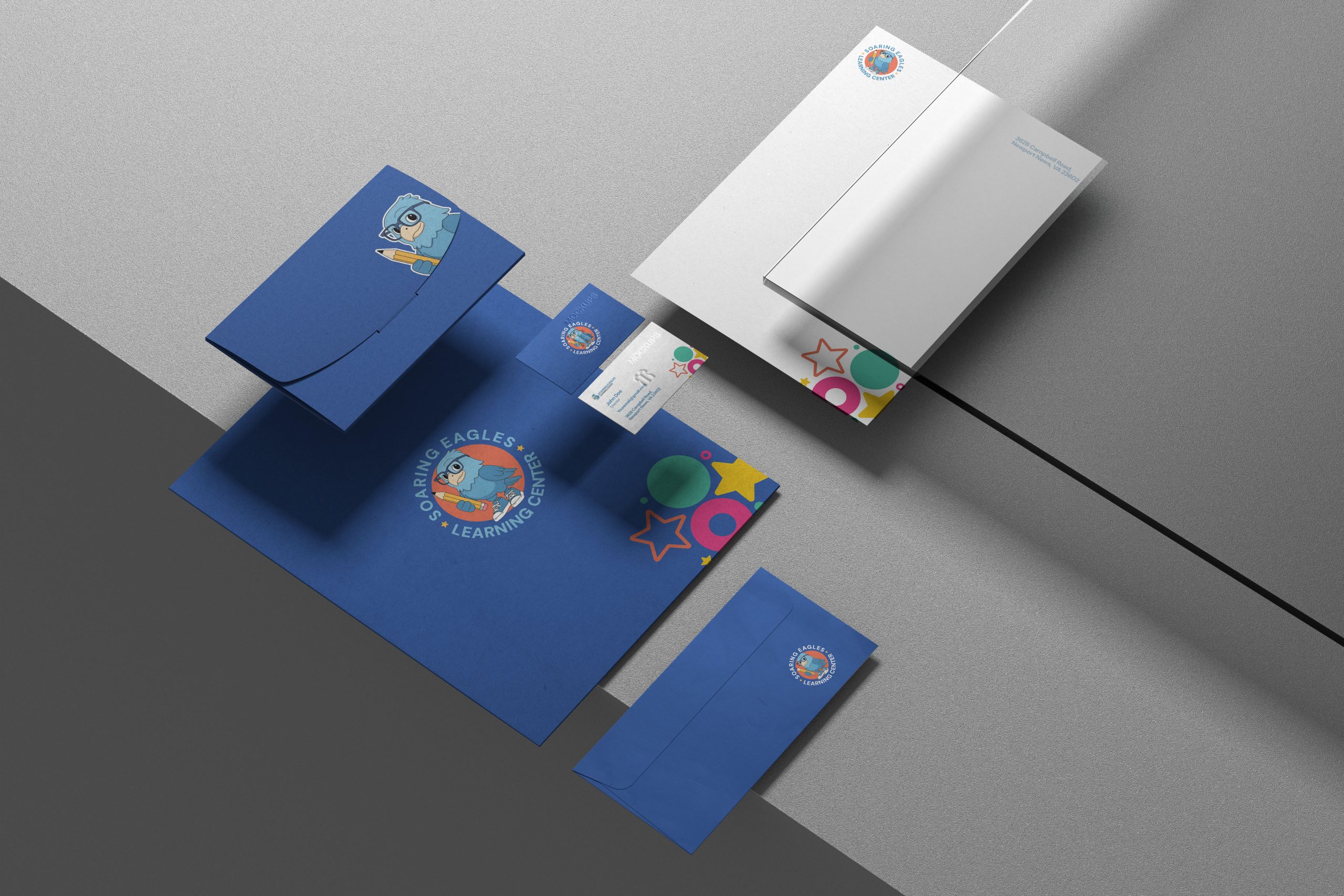
- Program flyers and enrollment materials
- Social content direction
Every element was designed to feel calm, organized, and child-centered, while still speaking to parents as decision-makers.
The Outcome
SELC now presents as a polished, dependable learning center with a brand that reflects the quality of care they provide. Parents can easily understand what SELC offers and what makes them different.
Services Delivered
Brand Strategy, Brand Guide, Visual Identity, Website Copy & Structure, Messaging Framework, Print Materials.
Really solid experience overall. Everything was delivered as promised, and the professionalism was clear from the beginning. There were a couple minor delays, but they were communicated properly. I appreciate the transparency.